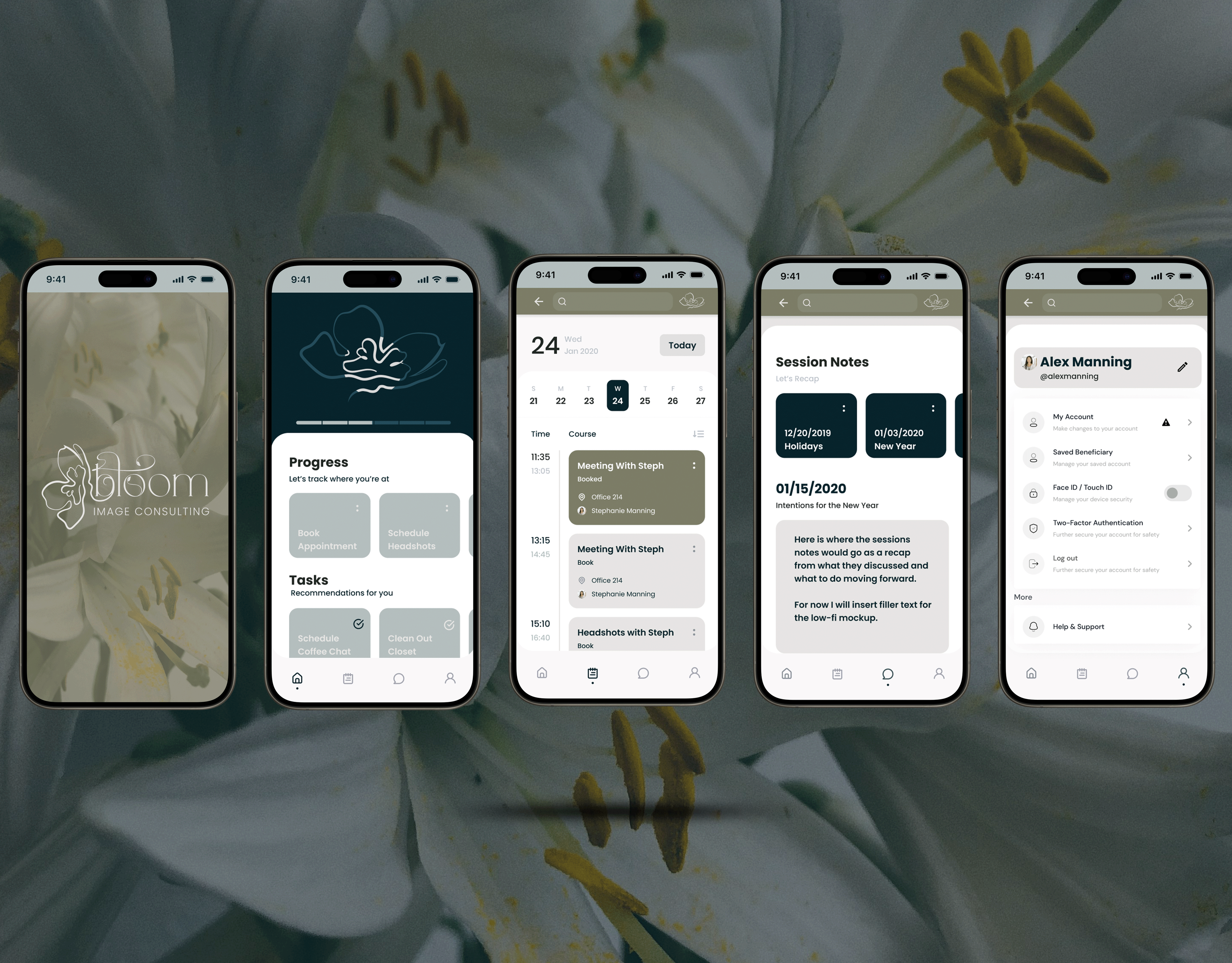
BRAND OVERVIEW & MISSION
At Bloom Image Consulting, we empower women to reclaim their confidence, redefine their identity, and embrace a fresh start after divorce. Just like a flower blooms with time, care, and resilience, we guide our clients through a transformative journey of self-reinvention and personal growth.
Our mission is to provide personalized image consulting, mentorship, and styling services that help women step into their best, most radiant selves—inside and out. Through wardrobe refinement, confidence coaching, communication skills, and self-care strategies, we equip our clients with the tools they need to move forward with strength, elegance, and renewed purpose.
At Bloom, we don’t just refresh wardrobes—we restore confidence, rebuild self-worth, and redefine what it means to thrive. It’s time to step into your power and bloom into the best version of YOU.
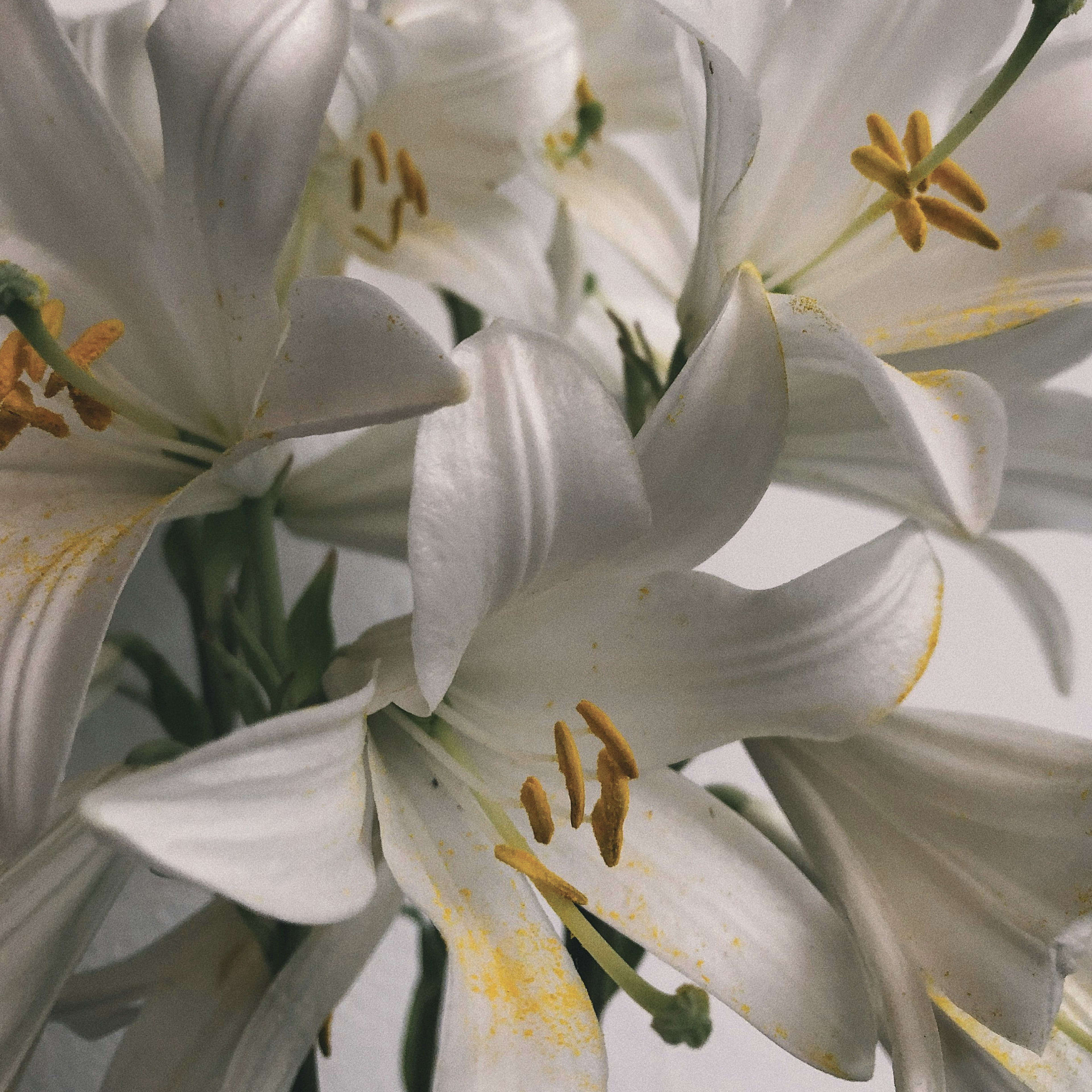
TYPOGRAPHY & IMAGERY INSPO AND EARLY ITERATIONS

TARGET AUDIENCE
Age Range: 30–55 years old
Marital Status: Recently or previously divorced
Location: Kansas City metro area, including suburbs
Income Level: Middle to upper-middle class (able to invest in personal development and image consulting)
Personal Styling & Image Consulting – Helping women redefine their wardrobe to match their new chapter in life
Social Media Rebranding – Refreshing LinkedIn, Instagram, and dating profiles to reflect confidence and authenticity
New Headshots & Profile Photography – Professional photo sessions for career, networking, or dating profiles
Confidence & Dating Counseling – Guiding women through the emotional and practical aspects of dating after divorce
Career & Personal Growth Mentorship – Assisting with workforce re-entry, networking strategies, and self-presentation
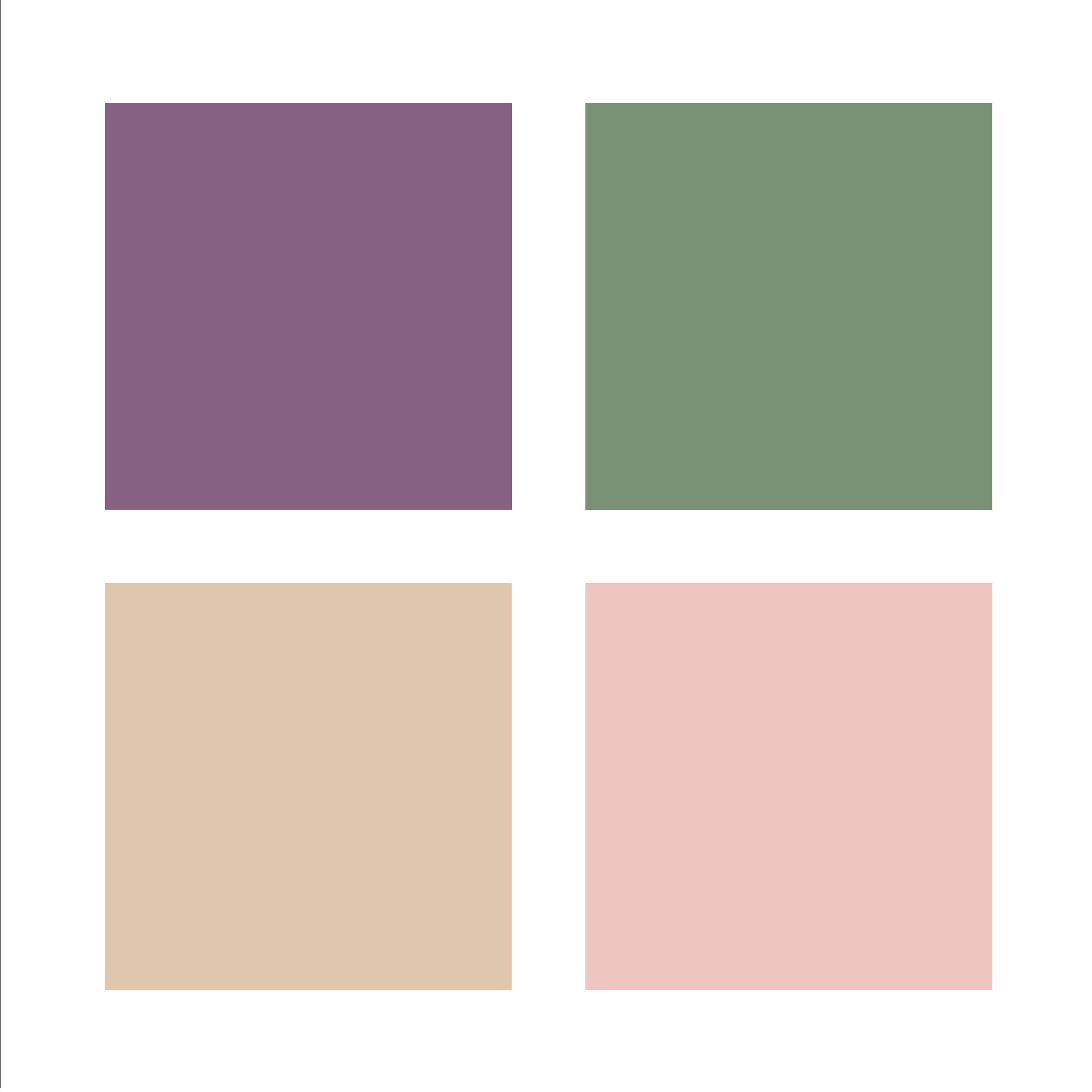
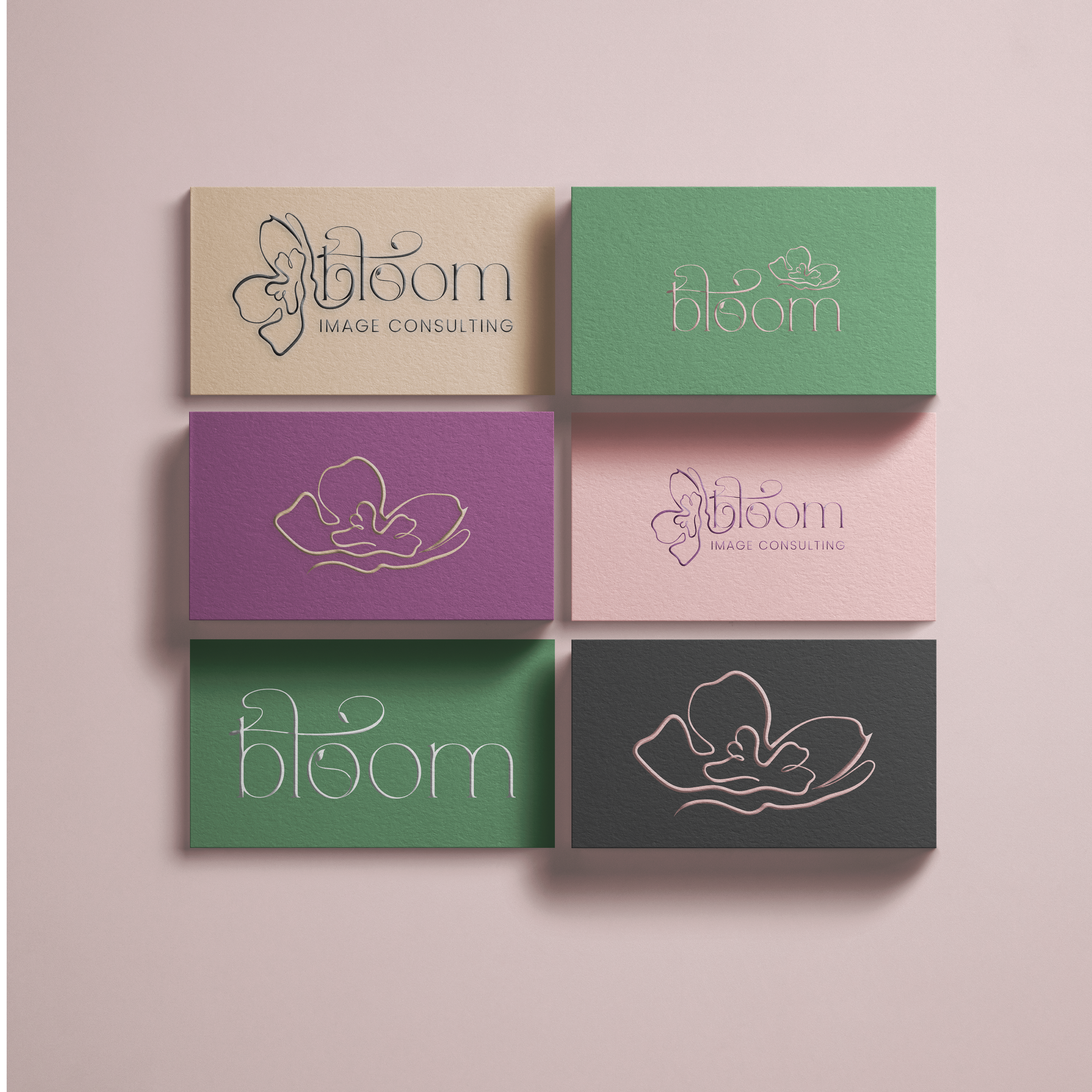
BRAND COLORS
Soft & Feminine Base Colors (Trust & Growth)
Blush Pink (#F4C2C2) – Represents self-love, renewal, and femininity.
Soft Nude (#E3C6A8) – Symbolizes elegance, warmth, and natural beauty.
Empowering & Sophisticated Accent Colors
Deep Mauve (#8B5E83) – A rich, muted purple that signifies wisdom, strength, and reinvention.
Muted Gold (#D4AF37) – A symbol of success, self-worth, and luxury.
Sage Green (#739072) – Represents growth, balance, and emotional healing.
Strong & Confident Contrast Colors
Charcoal Gray (#4A4A4A) – A neutral tone for professionalism and credibility.
Classic White (#FFFFFF) – Clean, fresh, and timeless—symbolizing a new beginning.
PROJECT SUMMARY
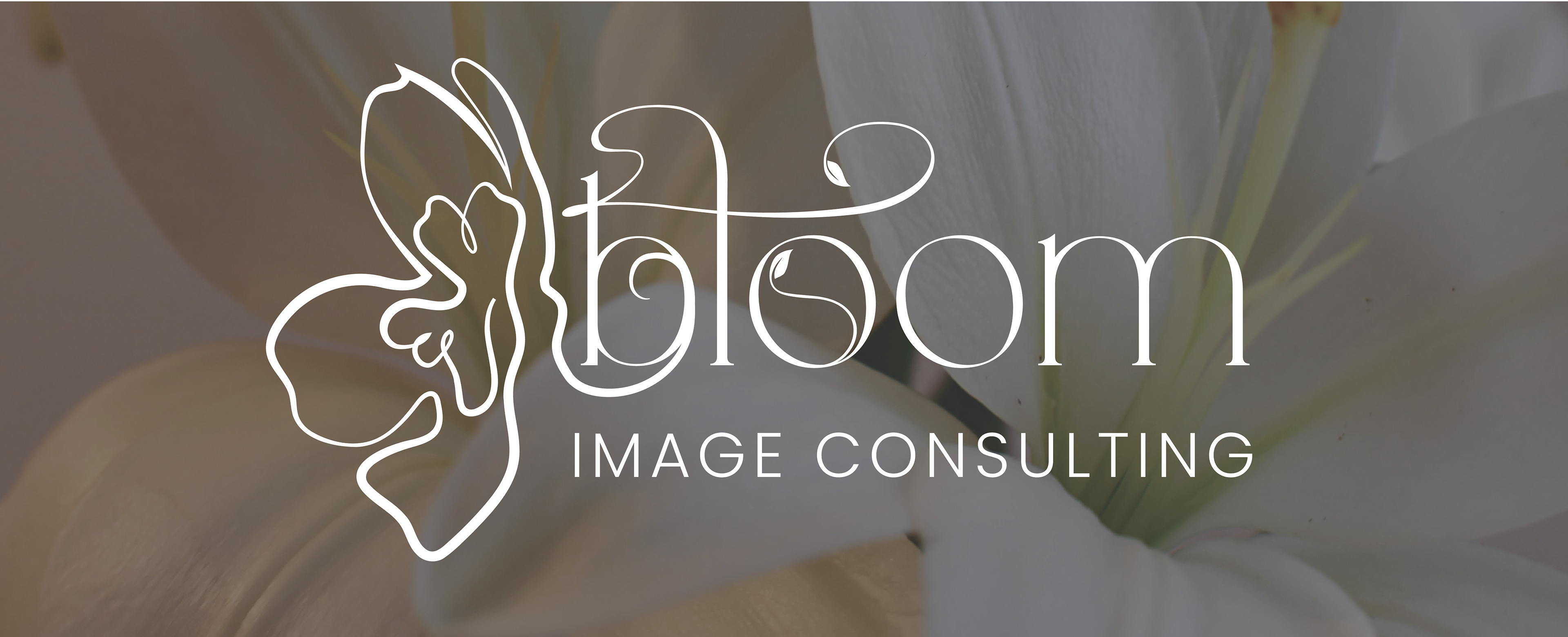
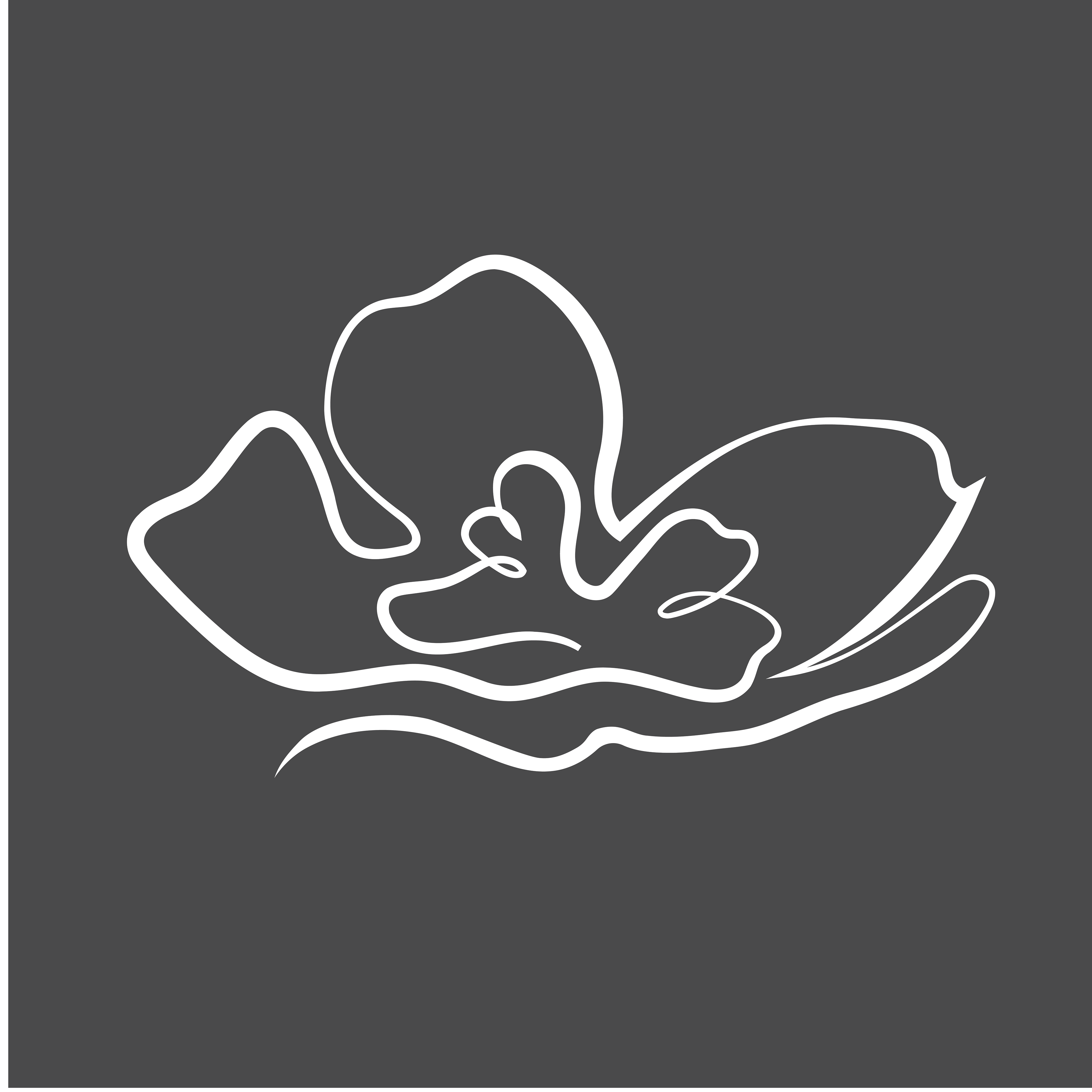
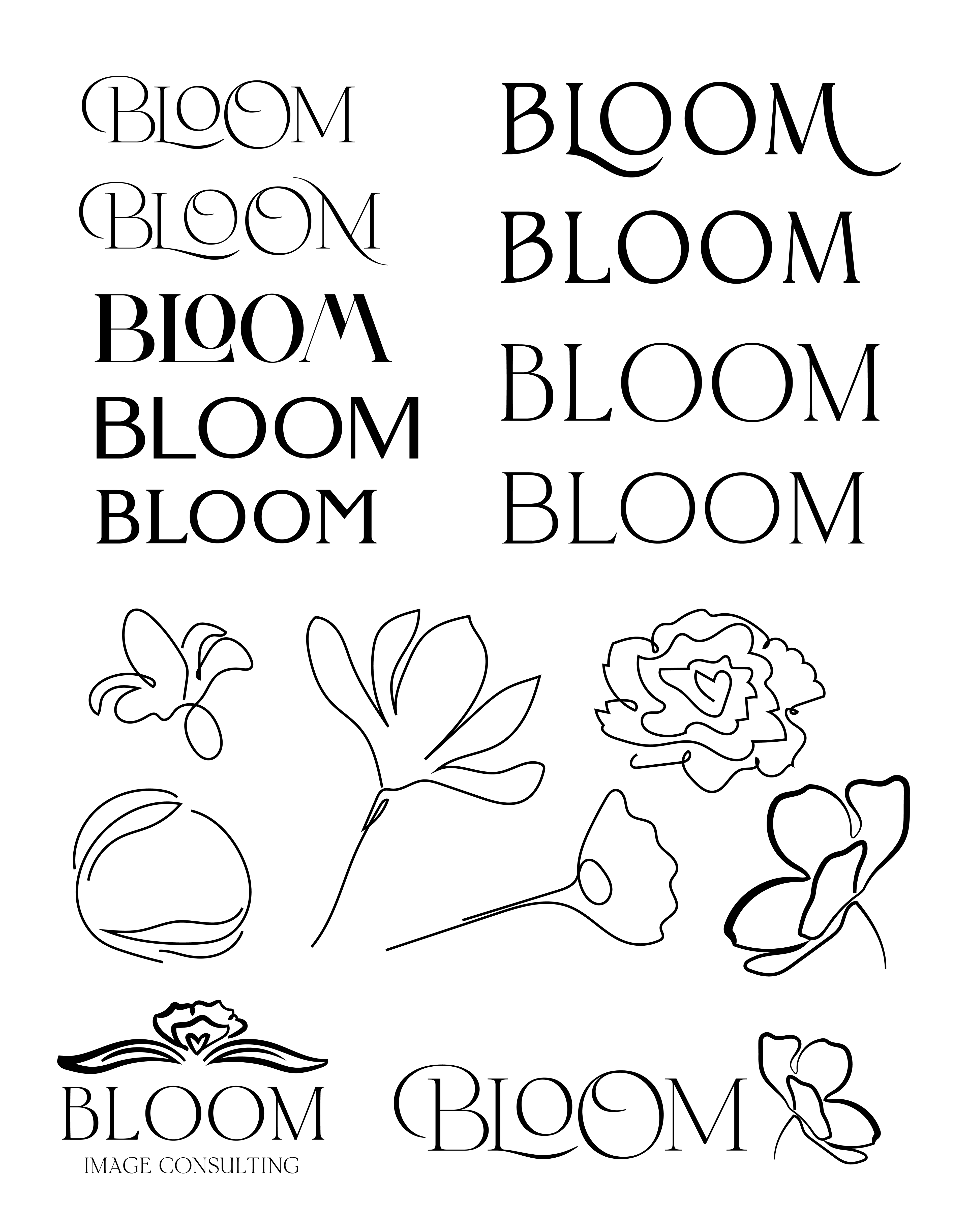
For this project, I focused on creating a logo that embodying the growth and development provided to empower women in their journeys starting a new chapter after a divorce.
The logo was inspired by the company name, Bloom Image Consulting, as it shows a blooming flower and vegetation surrounding the typeface. The colors are described as above to evoke the right emotions in growth and prosperity.
Overall, this project was a great way to practice brand and logo development as well as further my skills in the Adobe Creative Suite, particularly Adobe Illustrator, as well as client relations and developing a customer relationship.